Turnip: More settings for tracking your time in macOS!
30 April 2024
by Sarah
Matt and I have been hard at work on Turnip 1.4, and we think it’s the best Turnip ever. (Obviously.) We’ve also posted on Product Hunt today, so we’d love to hear your feedback over there. ❤️
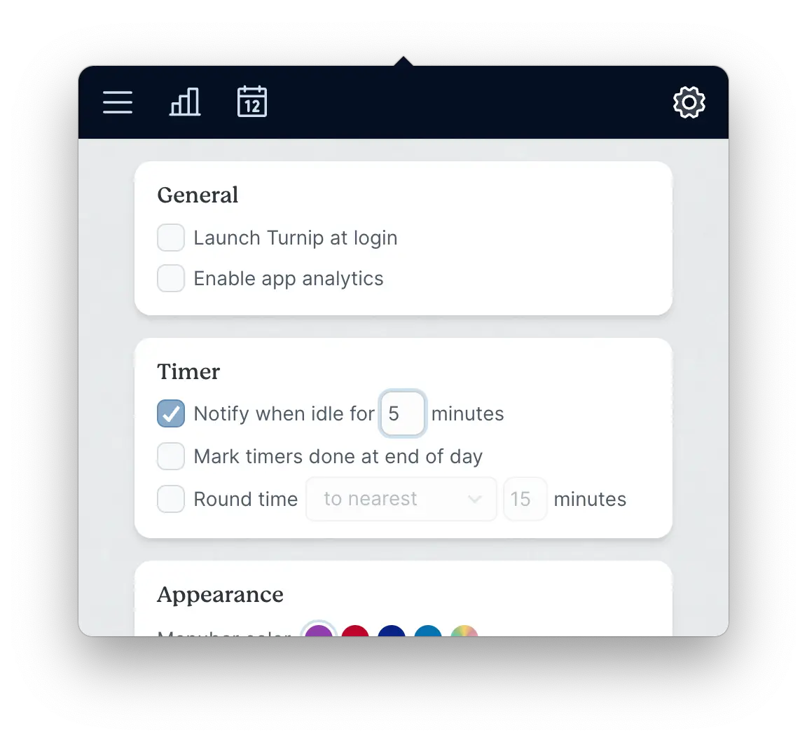
Idle time customisation
Want more control over how Turnip tracks your time? We’ve got you covered with new settings!
You’ll be able to set how long before Turnip asks you if you were idle, or disable the idle checks entirely.
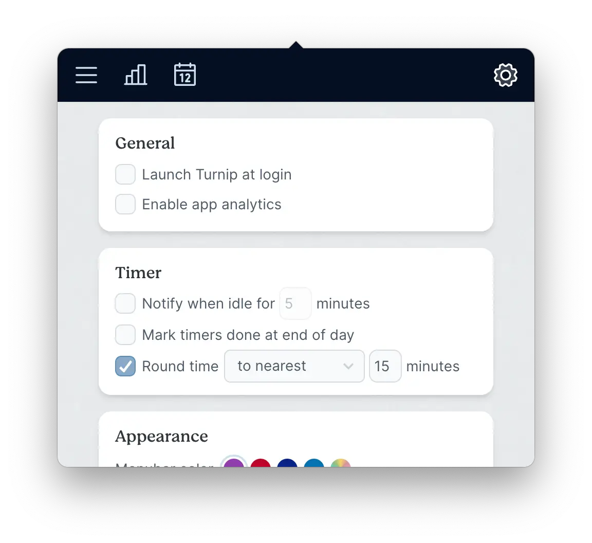
Time rounding
We've also added a setting to control how Turnip rounds your time. You can choose to round up, down, or to the nearest interval, and set the interval to whatever you like.
And of course, if you happen to be a stickler for precision, you can disable rounding entirely.
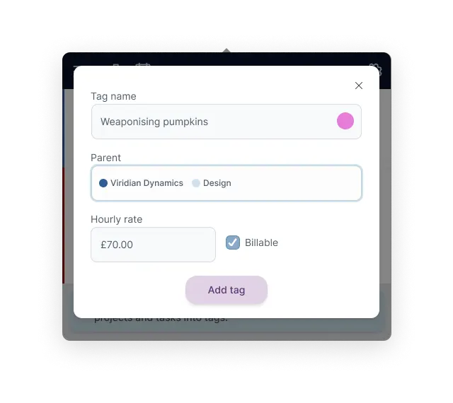
Edit integration tags
You can now add and edit integration tags directly in Turnip—no more switching to the FreeAgent or FreshBooks website to make changes! You can edit the name, hourly rate, and colour.
You can also add new tags directly from Turnip by selecting your project or company as the parent tag. Any new or updated tags will be synced back to FreeAgent or FreshBooks immediately. ✨
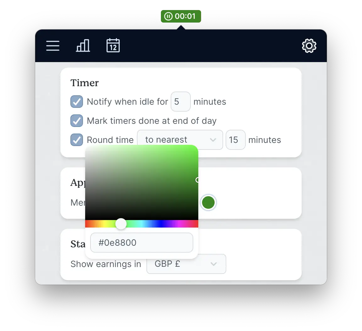
Customise menubar highlight
Not into purple? You can now change the colour Turnip uses for the active timer in the menubar.
We’ve provided some suggestions to get you started, but you can pick any colour your heart desires!
Softer look & feel
I definitely lean towards high-contrast designs. I recently tiled our new kitchen floor with hand-painted black and white cork tiles. You get it.
So I default to pretty stark form inputs—nice and visible, usable, but a bit blunt when used in an app context. This one’s been on my mind for a while.
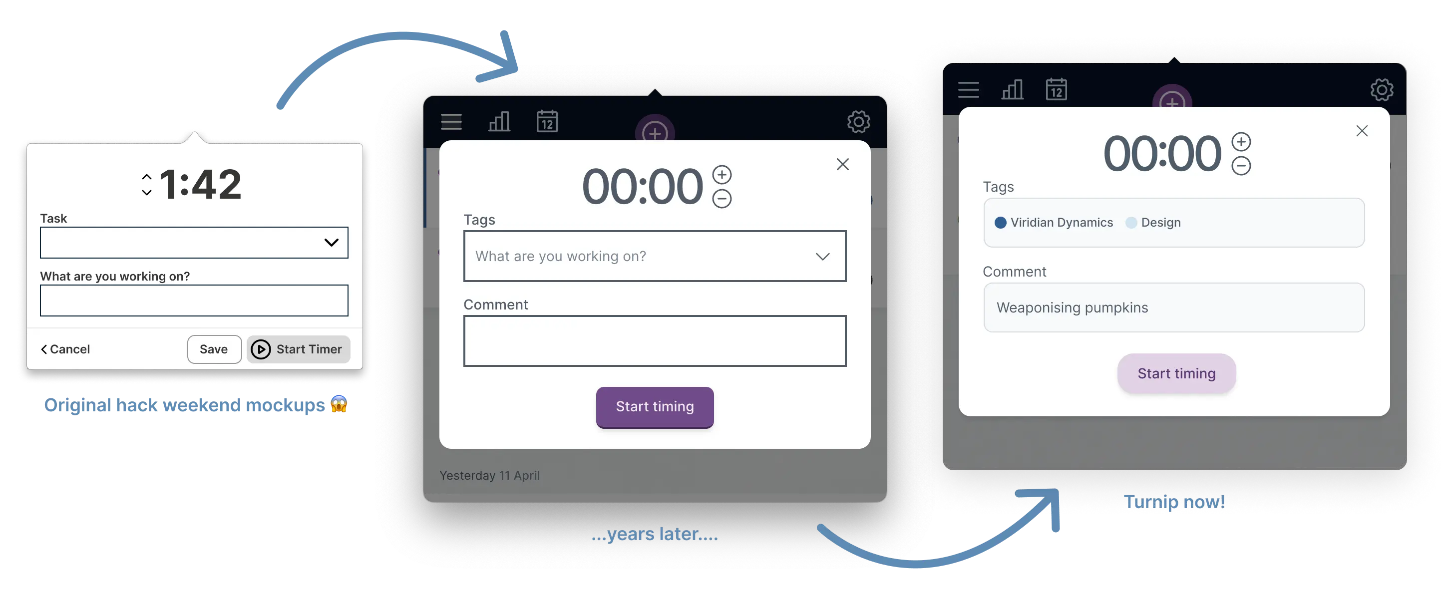
We’ve done a lot to dial back the contrast and soften everything so it’s easier on the eyes and a little less jarring, whilst still retaining its usability. Corners have been softened, colours are gentler, and everything’s been given a little mini facelift.
What do you think?
We’d love to hear your feedback! We’ve posted on Product Hunt today, so come on down and leave a comment, ask a question, or share your thoughts right here!
Back to all posts
Unsubscribe any time. We won’t ever share your information with anyone else. Privacy.
Made with and by Sarah and Matt
