Now we’re cooking with gas: hamburger menus in the kitchen
31 March 2022
by Sarah
Since the indoor temperature of my termite house/renovation project is currently a balmy seven degrees, I have been working from a rental flat in Aveiro until it warms up enough for me to go home. It’s a cute place in the historic centre of town, but it has—bar none—the worst cooker I’ve ever used.
And that includes the setup in my 1970s disaster-zone of a kitchen, which consists of a single IKEA hot plate and a toaster oven.
Let's just pick on the hood. Extractor hoods are super straightforward, right? You need a switch for the light somewhere, and a control for the fan. Boom. Done.
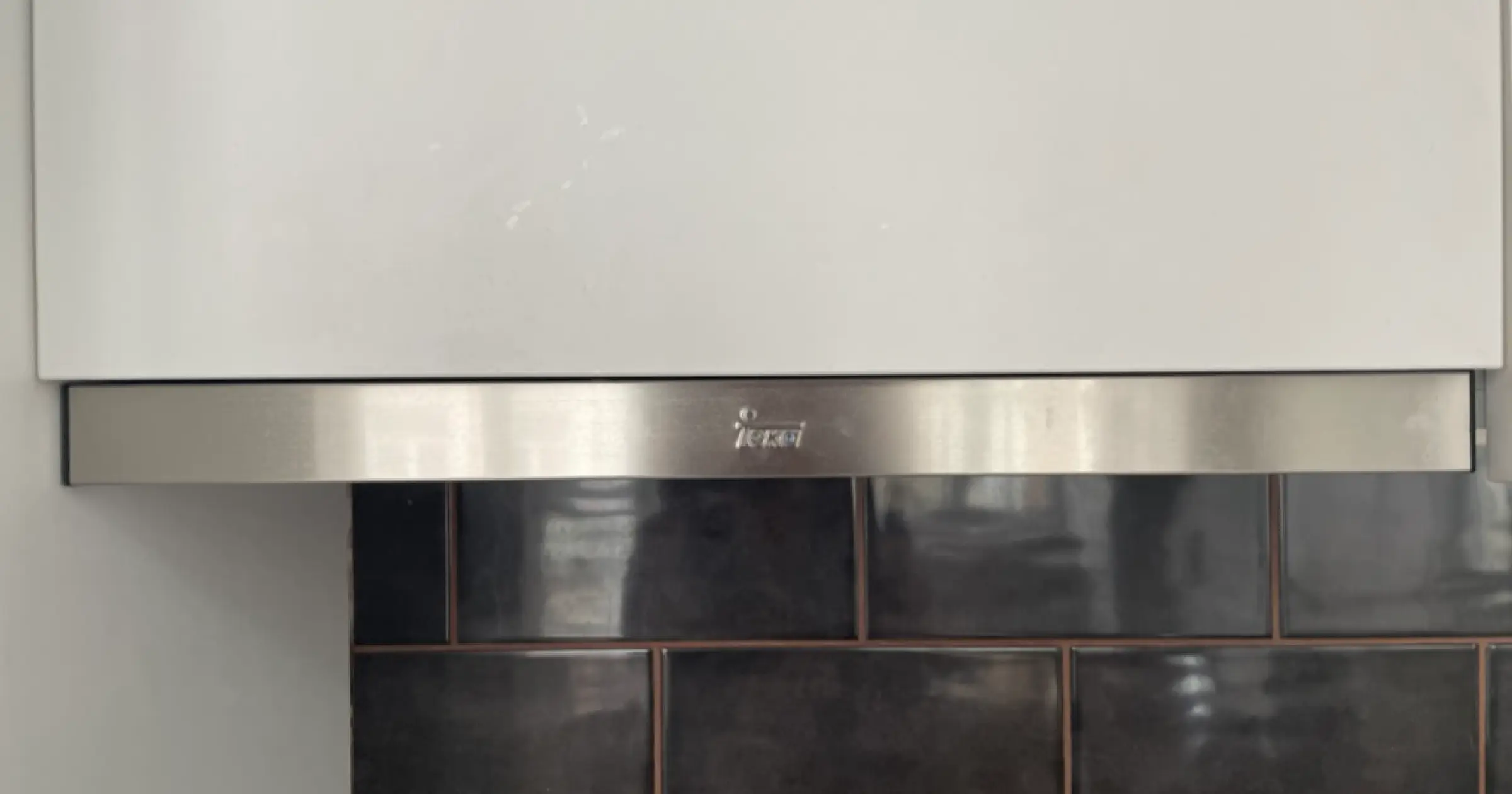 Question: how does one turn this on?
The first time I tried to use it, I spent a solid ten minutes searching throughout the kitchen for a way to turn the light on—a light switch, a secret plug somewhere, a mystery button underneath the hood. I checked five or six times to make sure there actually were lights under there. No dice.
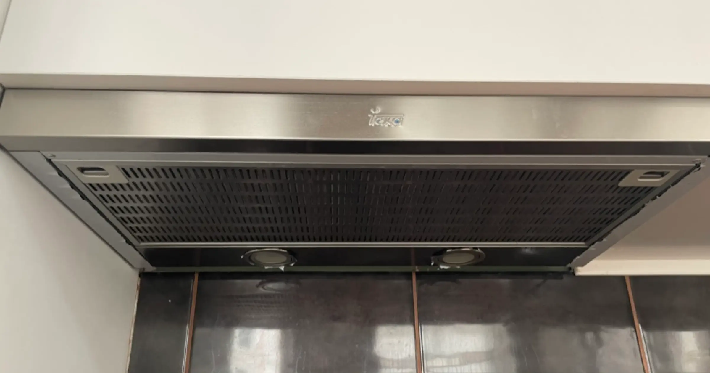 See? There’s stuff in there I would just love to use.
And then a power blip turned the fan on. We still couldn’t figure out how to turn it off, so we wound up ringing our host.
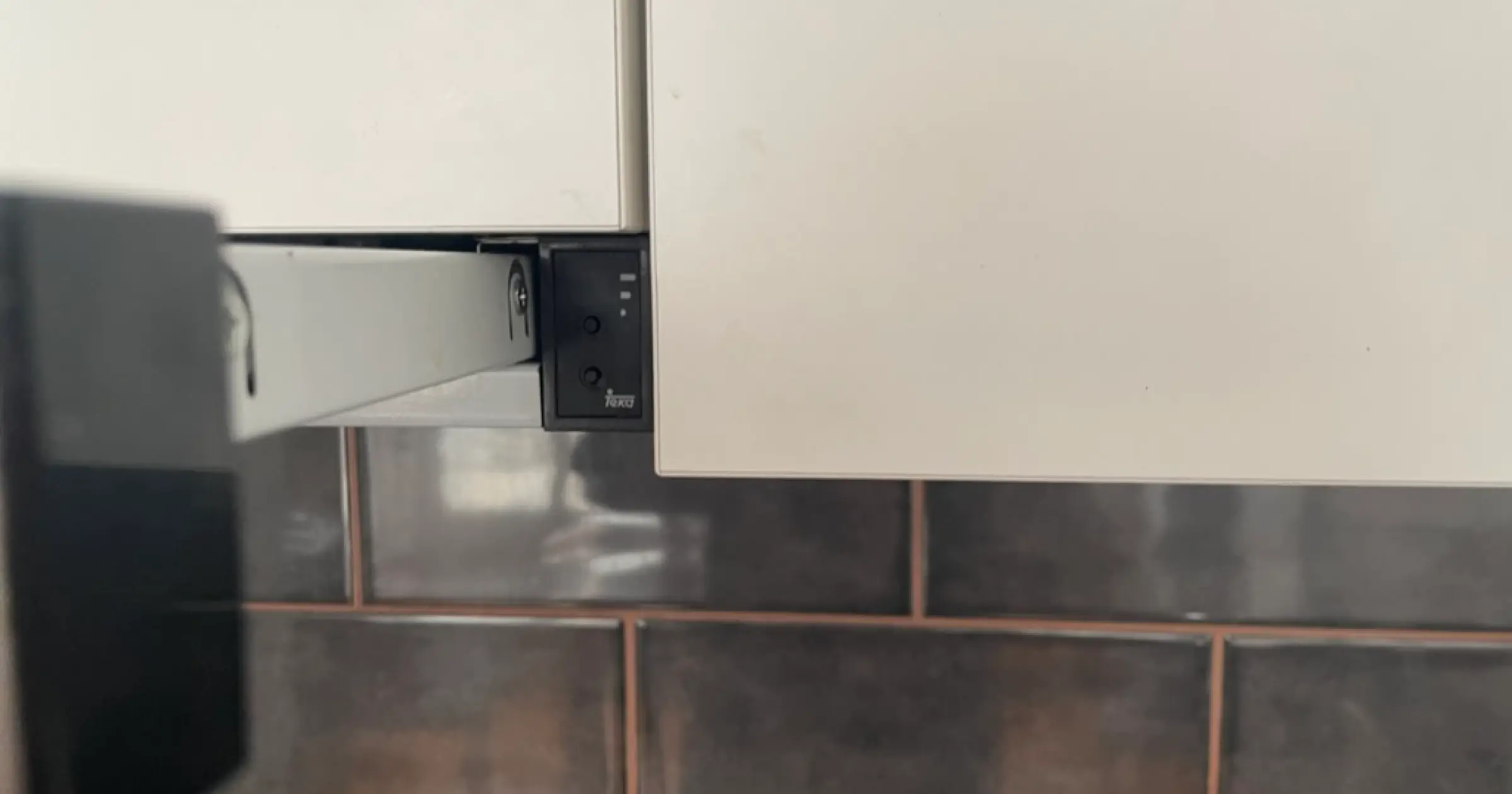
 Oh there they are! Why didn’t I think to look there?
Turns out the controls were hidden behind behind the front of the hood. To access the controls, you push against the edge, and the whole thing pops out to reveal a few invisible mystery buttons.
Why?!
In pursuit of simplicity
In design, we’re almost always working to simplify. Condense. Hide things away. Reduce clutter. Take one thing off.
This can lead to better, simpler products if done with careful, methodical intent. But done thoughtlessly, it leads to a situation where I need a manual to work a fan. The “junk drawer solution” here doesn’t actually simplify the task for the user. It actually takes more work and button-presses to access the hidden panel of buttons than it would if those buttons were placed on the ample space outside of the hood.
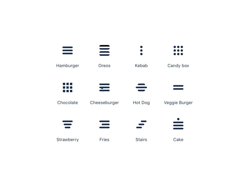
On the web, the equivalent is mystery-meat navigation. You know what I mean. Hamburgers. Kebabs. Other tasty treats that mean nothing in a usability context.
 Every burger shop whose website doesn’t use an actual burger for their hamburger menu is now dead to me.
(Source)
Some of these conventions I worked really hard to fight against when they first appeared, because in many respects they perform the same function that mystery cooker button does. They hide all the complexity of an interface in a “junk drawer”. See also: remotes.
 I suspect a fear of these is what lead to my becoming a designer, and also my refusal to own a remote that has more than three buttons on it.
My dad once had one with a hidden compartment that had EXTRA buttons. 😱
Hiding things makes them harder to find (duh)
We often build in these features because we think they’re what users want. We think they make things simpler, but they actually wind up making things more complex. Instead of needing to press two buttons, I need to press six. And I can’t even see the buttons once I’ve figured out how to access them, so I just press them at random until the right thing turns on.
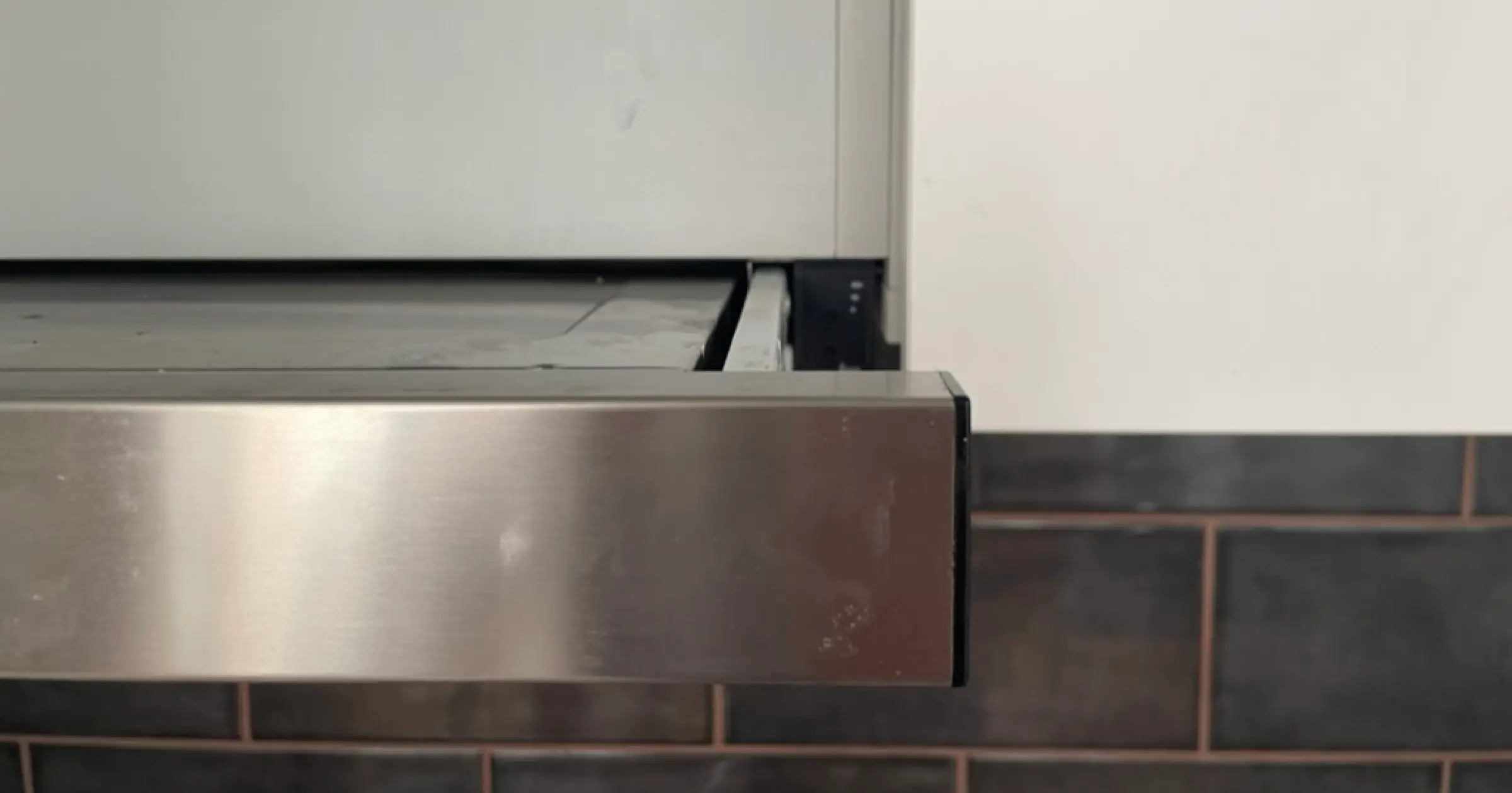
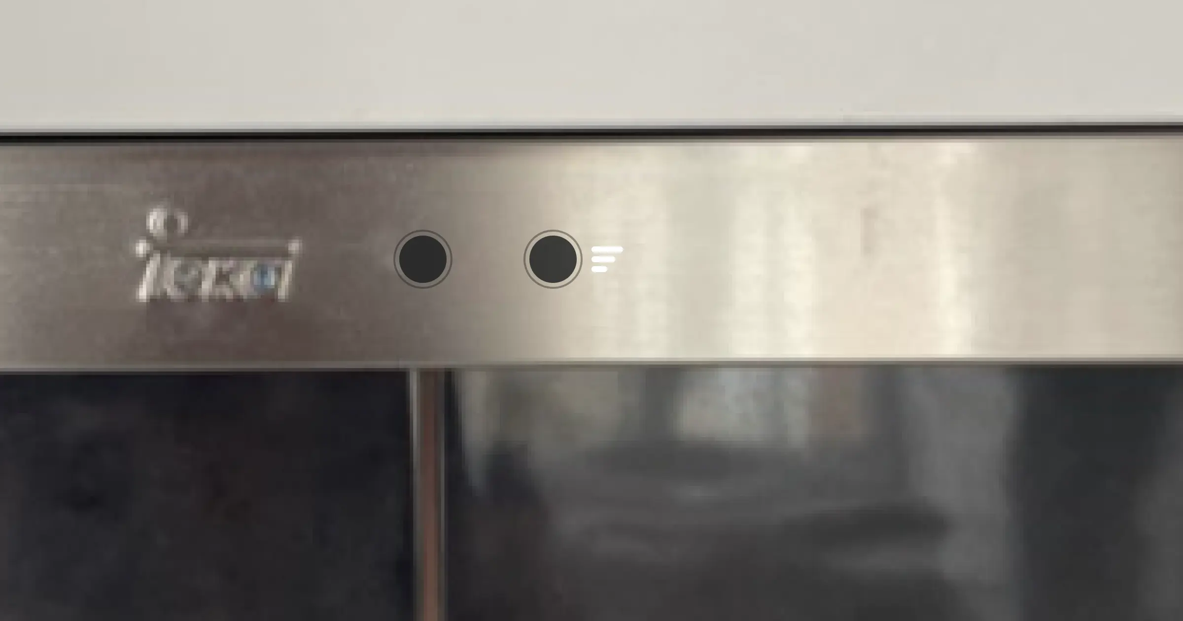
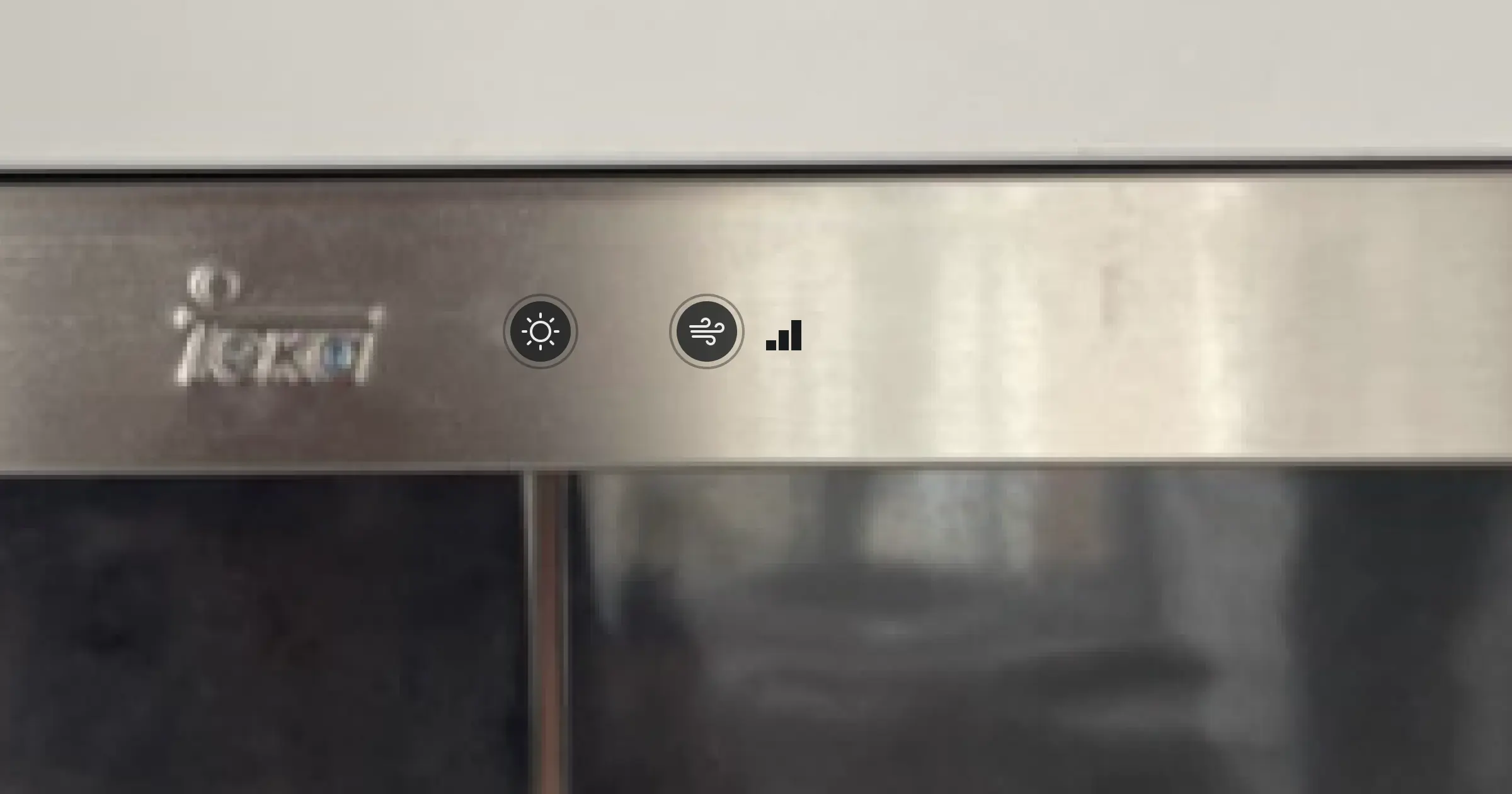
 Spoiler alert: this is pretty hard to see whilst cooking, especially since your head needs to be basically touching the edge of the hood.
Stuffing everything into a junk drawer is certainly easy—for the designer. But it's not easy for users.
It’s a terrible first-time user experience. There's absolutely no indication—no buttons, no affordances, no anything—to indicate there might be controls hidden somewhere in here. The only markings on the outside of the hood are the company branding. As a user, there's no way for me to intuit how to use the thing. It leave me in permanent "novice mode" and there's no way to progress or learn more.
The trouble is that once we hide something in a drawer, we forget about it. We don't need to worry about simplifying that underlying interface. We're effectively offloading our work on the user.
Instead of hiding all the controls, we need to figure out how to make those controls more usable. Stuffing them under the hamburger menu’s buns means that they become an afterthought—something we don’t need to consider until later in the design process. (Or, as is often the case: never.)
Designing a better cooker hood
So back to the terrible cooker hood I needed to phone a friend to figure out. How do we improve it?
 Just a reminder, in case you'd forgotten.
Well, let’s start by putting the buttons on the front of the hood, where we can actually see them.
That’s already removed one (hidden) button press, so that’s a great start. And now that it’s easier to see the buttons, we can at least guess at what their labels mean. Maybe it’s a good opportunity to think about how we might make those labels more clear. (The labels existing at all would help.)
If we wanted to, we could even add some extra buttons, so if you know you need the fan on its highest setting, you can just jump right to it, rather than pressing the fan button three times.
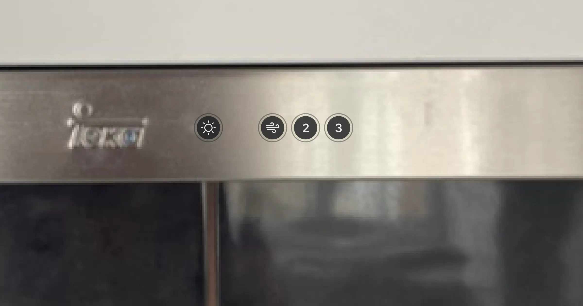
There! Now, if I want the fan on max, I only need to press a single button, and it’s right there in front of my face. Before I needed to press four buttons, and also scramble around for a hidden button and possibly get bonked in the face by a springing bit of metal.
What a time-saver!
How on earth does this apply to anything?
The takeaway here, if designing cooker hoods isn’t your day job, is to avoid hiding controls in an effort to reduce cognitive complexity for users.
I see lots of websites using a hamburger menu at all screen sizes these days, and it looks great—but it makes that website harder to use. I can’t see my available options right from the get-go, and any time I want to use the menu, I need to wait for it to appear, which, depending on how clever your animation is, might be a little while.
Even in the best-case scenario, I need to make at least one extra click in order to get to whatever I’m looking for.
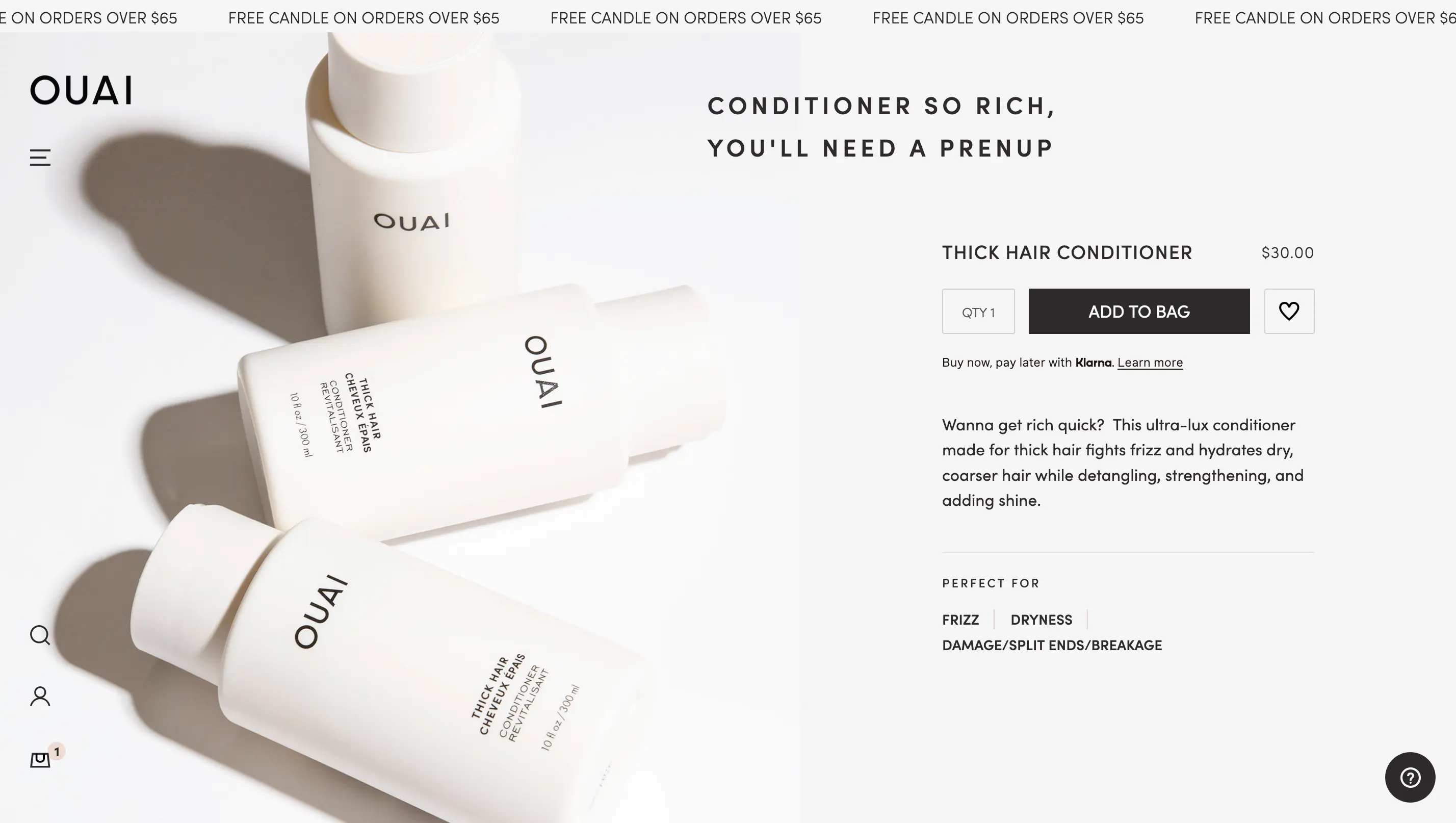 This looks very neat and tidy, but you know what would be more useful than a free candle promotion here? A MENU I CAN SEE. Let’s not even talk about the fact there’s an “Accessibility” link hidden somewhere at the bottom of that menu, once it’s taken five seconds to fully animate in.
Hamburger menus are useful when we lack the screen space to display a more complex navigation system. But when the space is available, we might do our users better by considering how to present controls in a way that’s obvious, clear, and as easy to access as possible.
Back to all posts
Unsubscribe any time. We won’t ever share your information with anyone else. Privacy.
Made with and by Sarah and Matt